
Before vs After: The PDP Rewrite That Fixes Your Conversion Gap
TL;DR — For Busy Founders
Your product page is the most expensive real estate in your funnel — and most D2C brands treat it like a catalog entry. Rising CPAs have made this a revenue problem, not just a UX problem. A structured PDP rewrite — scroll narrative, objection handling, sticky CTA — is the highest-leverage conversion fix available without touching your ad budget. This post breaks down exactly what changes and why it works.
Table of Contents
1. Why Most D2C Product Page Conversion Fail to Convert
They’re designed to look good. They’re not designed to close.
Most D2C Product Detail Page (PDP) are built by designers solving for aesthetics. The result is a page that passes the scroll-test but fails the decision-test. Clean layouts remove visual clutter — they also remove the information a buyer needs to say yes.
PDPs fail when design removes decision-critical information.
Missing answers are hidden objections. Every question your PDP doesn’t answer is a reason to leave.
- No size guide? The user guesses — and guesses wrong in their head.
- No ingredient explanation? They assume it won’t work for them.
- No shipping timeline? They check another tab and never come back.
- The same applies to visuals — here’s how product photos directly impact conversion decisions.
Minimalist design and high conversion are not the same goal. Brands like DaMENSCH, a men’s premium essentials brand, have built long-form PDPs specifically because their product requires conviction, not just curiosity.
This is exactly why short product descriptions fail to convert.
A PDP that looks premium but leaves questions unanswered converts worse than an ugly page that answers everything.
Thin content also fails AI agents. When tools like Google Shopping or AI-assisted search try to match your product to a buyer query, they need structured depth. A sparse PDP is invisible to those systems.
2. What Changed in 2026 That Makes PDPs Critical
Rising CPAs have made your product page a profit lever, not just a landing page.
CPAs across Meta and Google have climbed 25–40% in the last 18 months, a trend widely discussed in e-commerce benchmarks from Shopify. Every click costs more. That means your PDP either earns its keep or it destroys your margins.
Higher CPA forces PDPs to carry conversion responsibility.
When traffic is expensive, conversion efficiency is the only lever you control.
You can’t negotiate your CPC down. You can fix the page that traffic lands on.
Even a 1% increase in conversion rate can significantly improve ROAS without increasing spend.
- A 1% conversion rate increase on a ₹500/day ad spend compounds into real revenue at scale.
- Brands with strong PDPs reduce their effective CAC without reducing ad spend.
- AI agents and voice search now require structured product content to surface and recommend products accurately.
Hims & Hers, a men’s and women’s telehealth and personal care brand, built their growth model on conversion-dense PDPs. They don’t just describe the product — they handle objections, explain the mechanism, and guide the buyer through every concern before they can form it.
This shift is tied directly to how unit economics shape D2C content strategy.
Your PDP is your best-performing or worst-performing sales asset — there’s no middle ground when CPA is this high.
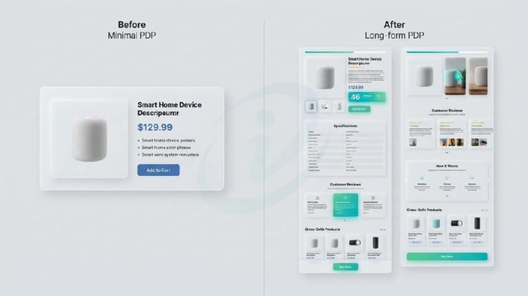
3. Before vs After: The Real PDP Breakdown
The rewrite transforms a catalog page into a sales system.
Here’s what the same product page looks like before and after a strategic rewrite. This isn’t theoretical — it’s the delta between pages that leak revenue and pages that close.
| Element | Before | After |
|---|---|---|
| Structure | Image + price + 3 bullets | Scroll-based narrative |
| Information | Tabs (hidden on mobile) | Progressive disclosure via scroll |
| Objection Handling | None | Dedicated FAQ section inline |
| CTA | Static “Add to Cart” | Sticky CTA visible at all times |
| Social Proof | Star rating near top | Contextual reviews placed near relevant claims |
| Product Explanation | Feature list | Mechanism + outcome framing |
| Visual Depth | Single hero image | Multiple use-case images + lifestyle context |
The before page describes the product. The after page sells it.
A PDP becomes a sales page when it removes uncertainty.
For a deeper breakdown, see how D2C product pages are optimized for conversion.
Gymshark, a performance apparel brand built on community and product obsession, runs PDPs that combine outcome language, contextual sizing guidance, and lifestyle imagery in a single scroll. No tabs. No buried information.
The difference between a catalog page and a sales page is not design — it’s whether unanswered questions have been eliminated.
4. Where Brands Lose Revenue
Revenue is lost in unanswered micro-questions — not bounce rates.
Founders look at bounce rate and see a traffic problem. It’s not. It’s a certainty problem.
Buyers don’t bounce randomly—they leave with a specific unanswered doubt. They leave with a specific, unresolved doubt. And most PDPs never even acknowledge those doubts exist.
This is the same pattern behind why most e-commerce blogs fail to generate sales
The three questions that kill conversions most consistently:
- “Will this fit / work for me?” — No size guide, no skin type filter, no use-case framing.
- “Is it actually worth ₹1,800?” — No mechanism explanation, no comparison, no outcome proof.
- “What happens after I buy?” — No returns policy visible, no delivery window, no trust signal.
Every unanswered question on your PDP is a revenue leak you’ve built into the page.
Brands selling supplements, skincare, and apparel — categories where doubt is highest — lose the most revenue here. Plum, a clean beauty brand, and Minimalist, a science-backed skincare brand, both use ingredient-level explanations on PDPs specifically because buyer hesitation in skincare is driven by not understanding what they’re putting on their skin.
Data Point: According to Baymard Institute research, the average cart abandonment rate is 70%+ — and a significant portion of that happens during PDP review, not at checkout.
You’re not losing buyers to competitors. You’re losing them to unanswered questions you already know they have.
5. The Conversion Gap: Why Traffic Doesn’t Equal Sales
High traffic plus low certainty equals wasted ad spend.
This is the conversion gap: the mismatch between what your ad promises and what your PDP delivers.
Ads create intent. PDPs must complete the decision.
Your ad creates intent. It shows the product in context, with an outcome. The buyer clicks because they’re interested — they’re already halfway to a purchase decision.
Then they land on a page that doesn’t match that energy.
PDP drop-offs typically exceed checkout drop-offs because uncertainty peaks earlier in the funnel.
- The ad showed a lifestyle outcome. The PDP shows a product spec.
- The ad created urgency. The PDP has no directional CTA.
- The ad targeted a specific pain point. The PDP doesn’t address it.
When your PDP doesn’t complete the decision your ad started, you’ve paid for a visit that never had a chance to convert.
This gap directly destroys your CLV:CPA ratio. You spend to acquire, the page fails to convert, and your customer acquisition cost inflates — even though the creative was working fine.
This misalignment is also why creative testing fails to scale results in D2C.
Shopify’s own data consistently shows that conversion rate improvements of 0.5–1% at the PDP level have larger revenue impact than equivalent improvements at checkout. The volume of exits is simply higher earlier in the funnel.
The conversion gap isn’t a traffic problem. It’s a page-depth problem — and it costs you on every single campaign you run.
6. The System: How to Rewrite a High-Converting Product Page
Use a structured long-form PDP framework — turn the page into a guided decision flow.
There’s a repeatable system for this. I’ve used it across premium D2C categories — grooming, supplements, apparel, homeware. The structure doesn’t change. The content does.
A high-converting PDP is a structured sales conversation.
The 6-Block PDP Framework:
- Hook (Problem Framing) — Open with the problem the product solves, not the product name. Buyers self-select immediately.
- Outcome Visualization — Show what life looks like after the purchase. Lifestyle image + one-line outcome statement.
- Product Mechanism — Explain how it works, not just what it does. This is the trust layer most brands skip.
- Objection Handling — List the 5 most common doubts in your reviews and answer each one directly. This is where conversions happen or die.
- Social Proof (Contextual) — Don’t stack all reviews at the bottom. Place relevant reviews next to the claims they validate.
- Sticky CTA — “Add to Cart” must be visible at all times on mobile. Every scroll away from the CTA is a potential exit.
This ties directly into add-to-cart optimization strategies that improve conversion.
A high-converting PDP is not a design exercise — it’s a sales conversation structured as a page.
This framework also makes your PDP readable by AI agents. Structured depth means your product gets surfaced and recommended accurately when buyers use AI-assisted shopping tools — an increasingly significant traffic source in 2026.
7. Tabs vs Scroll: The Hidden Conversion Killer
Tabs reduce visibility and engagement on mobile — and most of your traffic is mobile.
Tab-based PDPs were designed for desktop. They made sense when screens were wide and users explored. That behavior doesn’t exist on mobile.
Hidden information is perceived as missing information.
- Mobile users scroll. They do not tap through tabs.
- Critical information hidden in a “Details” or “Ingredients” tab is effectively invisible.
- The decision to buy gets made with incomplete information — and incomplete information = no purchase.
Mobile traffic often accounts for 60–70% of D2C sessions, making scroll behavior critical.
If your PDP hides content in tabs on mobile, you’ve built friction into your highest-traffic format.

The fix is progressive disclosure via scroll. Every piece of information — ingredients, how-to-use, shipping, reviews — lives in the scroll path. Users encounter it naturally instead of having to hunt for it.
DaMENSCH moved away from tabbed layouts on their PDPs and toward full-scroll architecture specifically to reduce mobile drop-off. The logic is simple: show the buyer everything they need without requiring them to take an action to find it.
Tabs are a UX convenience for desktop. On mobile, they’re a conversion barrier disguised as clean design.
8. Who This Strategy Is Actually For
Not every product needs a long-form PDP. Know which category you’re in.
This framework is highest-impact for specific product types. If you’re not in one of these, the ROI on a full PDP rewrite is lower.
PDP depth should match buyer decision complexity.
This is the right strategy if:
- Your product price point is ₹800 or above
- Purchase requires consideration (skincare, supplements, apparel, homeware)
- Your CPA has risen and you can’t cut ad spend
- Customers regularly ask the same questions in reviews or support tickets
- You’re targeting buyers who do their research before buying
This strategy is not the priority if:
- You’re selling low-ticket impulse items (under ₹400)
- Your product is a commodity with no differentiation
- Your traffic is already converting above category average
Long-form PDP depth earns its cost when buyer doubt is high. If your buyer doesn’t need convincing, a minimal page works fine.
Amazon has proven that for commodity products, conversion is driven by price and delivery — not page depth, largely due to its fulfillment advantage through Fulfillment by Amazon.
9. What You Should Do Next
Audit your PDP for missing certainty — that’s where your revenue is hiding.
You don’t need a full redesign. You need a strategic rewrite.
Four actions you can take this week:
- List your top 10 customer doubts — pull them from reviews, support tickets, and DMs. These are your objection handling targets.
- Check if your PDP answers each one — not in tabs, not buried. In the visible scroll path.
- Convert tabs to scroll sections — move hidden content into the page structure. Every piece of information should exist without requiring a click.
- Add a sticky CTA — if your “Add to Cart” disappears when the user scrolls, you’re losing mobile conversions you’ve already paid for.
Every day your PDP has an unanswered objection is a day you’re paying for traffic that can’t convert.
You don’t need more traffic. You need a page that converts the traffic you already paid for.
→ Start with a PDP audit: identify missing objections and friction points
→ Compare your page against a structured conversion framework
→ Then decide what to fix or rewrite
If you want a structured breakdown of your page, request a PDP audit here .
If your social content is getting likes but not conversions, the design layer is usually where the breakdown happens. At Izwiq Digital, we help e-commerce and D2C brands build content systems that pass the trust test — without expensive production.
FAQ
Should PDPs always be long-form?
No. Long-form PDPs are built for high-consideration purchases where buyer doubt is real. For low-ticket impulse products, depth adds friction without benefit. Match your page depth to your buyer’s decision complexity — not to what looks impressive.
Are tabs always bad for product pages?
On mobile, yes — for conversion-critical information. Tabs work fine for supplementary content (brand story, shipping policy) that doesn’t affect the purchase decision. But anything that answers a buyer’s core objection needs to live in the scroll path, not behind a click.
What’s the fastest single fix for a underperforming PDP?
Replace tabs with scroll sections and add a sticky CTA. These two changes cost nothing in ad spend, take a day to implement in Shopify, and directly address the two highest-impact mobile conversion failures. Start there before touching anything else.
Does design still matter if content is doing the work?
Yes — but the goal of design shifts. Design must support information clarity, not compete with it. The mistake brands make is letting aesthetic decisions override content decisions. Your layout should make the content easier to read and trust — not replace it.
About the Author
Muhammed W is a content strategist at Izwiq Digital, working directly with small business, D2C and e-commerce brands on SEO content, social media systems, and conversion-focused design.
The insights shared here are based on hands-on client work across health, beauty, SaaS, and B2B — focused on improving engagement, trust, and conversion metrics. Learn more about our services