
Product Photos That Convert: 7 Image Types Every PDP Must Have in 2026
TL;DR — For Busy Founders
Your product photos are not a branding exercise. They are your last line of defence before a customer leaves without buying. Most D2C brands over-invest in studio shots that look polished but fail to convert — because they answer aesthetic questions, not purchase questions. This post breaks down the 7 image types that actually move buyers from “maybe” to “add to cart,” why missing even two of them is costing you real revenue, and a simple 70/30 framework to fix your visual stack without a full reshoot. If you’re spending on paid traffic and your PDP conversion rate is sitting below 3%, your images are likely the problem.
Table of Contents
The New Reality of Conversion-Driven Product Photography
There was a time when a clean white background and a well-lit product shot was enough to signal quality. That era is done. I’ve worked across enough D2C accounts — from scrappy Shopify stores doing ₹2L/month to brands pushing ₹2Cr+ in monthly GMV — and the pattern is consistent: the brands that scale are the ones that stopped treating images as design assets and started treating them as decision-making infrastructure.
Think about what a customer is doing on a PDP. They’re not admiring your photography. They’re answering a question: can I trust that this product is right for me? Every image either answers that question or introduces doubt. There’s no neutral.
The shift happening in 2026 isn’t just consumer behaviour. AI shopping agents — tools that browse, compare, and shortlist products on behalf of users — are now parsing your PDPs too. These agents index alt text, image variety, and contextual visual cues to determine product fit. A PDP with only studio shots looks sparse to both humans and AI crawlers. Brands building their visual stack now are getting a head start on the next layer of organic and agent-driven discovery.
Why Most Product Photos Don’t Convert
Here’s the myth I keep running into: “our photos are professional, so that’s not the problem.” Professional and high-converting are not the same thing. Not even close.
Most brands — and I’ve seen this across skincare, fashion, home décor, supplements, and electronics — make the same mistake. They shoot for aesthetics and call it strategy. The result is a gallery of beautifully lit, perfectly centred product shots that tell the buyer almost nothing useful.
The three failure modes I see most often:
Overuse of studio shots. Five angles of a product floating on a white background doesn’t build confidence. It builds indifference. The buyer already knows what the product looks like. What they don’t know is how big it is, what it feels like, and whether it fits their life.
No context, no scale, no trust. boAt sells earbuds to millions of customers. But if their PDP only shows the product isolated, a first-time buyer can’t gauge fit, size, or how it compares to what they already own. Scale blindness is a silent conversion killer.
AI-generated perfection is backfiring. This one’s new and worth paying attention to. Brands using AI to generate product imagery are creating visuals that look too clean — uncanny valley for physical products. Buyers are increasingly sensitive to images that don’t look real, and when something looks fake, trust drops before a single word is read.
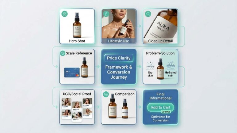
The 7 Image Types That Drive Sales
This is the core of everything. If your PDP doesn’t have most of these, you’re leaving conversions on the table regardless of how much you’re spending on traffic.
1. Environmental Hero Shot
Your first image sets the entire frame. And a white background shot as image #1 is a missed opportunity. An environmental hero shot places the product in a real-world context — a skincare bottle on a marble shelf at golden hour, a gym bag dropped against a locker room wall, a coffee mug on a kitchen counter mid-morning. It tells the buyer: this product belongs in your life. Brands like Minimalist have started moving toward environmental heroes on their first PDP image, and the rationale is conversion, not aesthetics.
2. Lifestyle / Action Shot
If the environmental hero says “this belongs in your life,” the lifestyle shot says “here’s someone exactly like you using it.” The research — including findings from Baymard Institute research on product imagery — consistently shows that in-context imagery performs better on emotional categories like apparel, wellness, home, and fitness. The Souled Store does this well: their lifestyle shots feature real-looking people in actual use scenarios, not model composites in a sterile studio.
3. Scale Reference Shot
I call this one the Scale Blindness Trap, and it trips up brands constantly. A buyer looking at a rug, a supplement bottle, a tote bag, or a skincare jar cannot understand size from a standalone shot — no matter how good the photography is. Put the product next to a hand. Or a door frame. Or a coffee cup. One image that grounds the size removes a hesitation most buyers won’t even consciously articulate — they’ll just leave.
4. Detail & Texture Shot
Perceived quality is driven by what the eye can verify. For fashion, it’s the stitch. For supplements, it’s the capsule coating. For electronics, it’s the port finish. Close-up detail shots do the work that product descriptions can’t — they activate sensory trust. Plum’s skincare line does this methodically: texture shots showing serum consistency and product application give buyers a tactile reference without physically touching the product.
5. Problem-Solution Shot
This is underused and one of my favourites. Show the problem the product solves — visually — then show the product resolving it. A posture corrector brand showing a side-by-side of slouch vs. corrected posture with the product in frame is not just compelling; it’s doing the job of your entire sales copy in a single image. Mamaearth uses this format effectively in their anti-pollution skincare line, showing skin condition before and product application after.
6. UGC / Social Proof Shot
User-generated content on a PDP is not a nice-to-have in 2026. It’s a trust mechanism. An actual customer photo — even if it’s slightly lower resolution, slightly imperfect lighting — converts better than a polished brand shot in most product categories. Why? Because it’s verifiable. A user-generated content strategy for Shopify brands that channels UGC directly into PDP image galleries (not just reviews) can lift conversion rates meaningfully, particularly for products where social proof is a primary purchase trigger.
7. Comparison / Context Shot
This image answers the question: “how does this compare?” It could be a size comparison (small vs. large variant), a before/after, or a product stacked against a common alternative. For a brand selling reusable bottles, one image comparing their bottle’s capacity to a standard 500ml store-bought bottle is worth three lifestyle shots. Buyers who are comparing across tabs will close the deal faster when you do the comparison work for them.

The Conversion Gap: Why Traffic Doesn’t Turn Into Sales
Here’s what actually happens when a potential buyer lands on a PDP with weak visuals. It’s not a conscious rejection — it’s a series of micro-anxieties that accumulate into an exit.
They can’t tell how big the product is. A small hesitation. They scroll to the next image. Still no context. The doubt compounds. There’s no human in any shot. No one to relate to, no body to compare against, no emotion to mirror. The price point starts to feel uncertain. And then — without ever articulating why — they close the tab.
This is the conversion gap. It’s not a price problem, it’s not a targeting problem, and it’s definitely not a traffic problem. It’s a trust gap created by images that answer the wrong questions. Spending more on Meta ads doesn’t fix this. Neither does a better headline. The buyer needs visual clarity before they’ll commit, and if your images can’t provide it, no other lever will compensate.
Brands reducing return rates with product visuals are solving this exact problem at the source. A return happens when expectation doesn’t match reality. Strong scale shots, texture shots, and UGC shots close that expectation gap before checkout — which means fewer returns, lower reverse logistics costs, and better net revenue per order.
Even if users stay longer, weak add-to-cart optimization strategies can still kill conversions at the final step.
| Image Type | Trust Impact | Conversion Impact | Return Rate Impact |
|---|---|---|---|
| Studio Shot (white bg) | Medium | Low | High (expectation mismatch) |
| Lifestyle / Action Shot | High | High | Medium |
| UGC Shot | Very High | High | Low |
Where Brands Lose Revenue
Let me be direct about where the money disappears.
Too many brand shots, not enough decision shots. I’ve audited PDPs where 6 out of 8 images are variations of the same studio angle. That’s a branding portfolio, not a conversion gallery. Every image slot that isn’t earning its keep is dead real estate.
AI-looking visuals are creating expectation mismatches. When a customer receives a product that looks slightly different from an AI-generated PDP image — different colour tone, slightly different finish — the cognitive dissonance triggers a return. The product doesn’t have to be wrong. The image just had to be misleading enough. That’s a CAC problem and a customer satisfaction problem rolled into one.
Missing mobile-first optimisation is killing ROAS. Most D2C brands still photograph and sequence images on desktop logic. But the majority of traffic — and an increasing share of conversions — happens on mobile. An image that reads well at 1400px wide often loses all its detail and emotional cues at 390px. If your first three images don’t hold up on a 6-inch screen, you’re burning ad spend.
The 70/30 Visual System
This is the practical fix. I use this framework across D2C visual commerce consulting, and it applies whether you’re building a new PDP or restructuring an existing one.
30% Brand Anchor: These are your studio shots. Clean, well-lit, colour-accurate. They signal professionalism and set the baseline. You need them. But they do not drive conversions alone — they anchor brand credibility so the rest of your gallery can do the selling.
70% Conversion Engine: This is everything else — lifestyle shots, scale references, UGC, detail close-ups, problem-solution frames, comparison shots. These are the images that answer purchase questions. They reduce hesitation, build contextual trust, and make the decision easier.

This framework applies across your PDP gallery and ties directly into your broader product page optimization guide. If your Meta ads are running the same studio-heavy visuals as your PDP, your ROAS on prospecting will reflect it.
D2C visual commerce trends in 2026 are moving firmly toward this model. Brands that adopted a conversion-first image strategy in 2024-25 are now reaping the CAC benefits — because better PDPs mean more people convert from existing traffic, which reduces the pressure to constantly acquire new audiences.
Mobile-First Image Optimization That Actually Converts
Image order matters more than most brands realise, and it matters most on mobile. On desktop, a buyer might scroll a gallery leisurely. On mobile, they swipe — and the first three images are your entire first impression.
For e-commerce image optimization for mobile, here’s what I recommend applying immediately:
Image 1: Environmental hero or lifestyle shot. Something that places the product in context immediately.
Image 2: Scale reference or detail shot. Answer the size question fast.
Image 3: UGC or problem-solution shot. Add the human element and social credibility before they bounce.
Everything after image 3 is bonus conversion material — important, but the buyer has already formed a significant chunk of their opinion by then. If images 1–3 aren’t doing their jobs, the rest of the gallery doesn’t get a fair viewing.
Also: test your images on an actual phone, not a browser simulation. What looks great in Figma or Shopify’s desktop editor often loses punch at actual mobile resolution. Compression artefacts, text overlays that become illegible, and portraits that get cropped awkwardly — all of these are conversion leaks that live testing catches quickly.
If You’re Still Using Only Studio Shots…
This section is for the brands this advice is most relevant to: D2C and e-commerce brands running paid traffic, spending on acquisition, and wondering why conversion rates aren’t moving.
If your PDP gallery is still exclusively studio shots, you’re likely in one of two situations. Either you’re early-stage and haven’t had the budget or bandwidth to build out a full visual stack yet — which is understandable, but it’s the thing to fix next. Or you’re a growth-stage brand that’s over-indexed on brand building and under-invested in conversion infrastructure.
The second scenario is more expensive than it looks. Because every month you’re running ads to a PDP that doesn’t convert efficiently, you’re paying to generate traffic that your images are then failing to close. That’s a compounding CAC problem.
Scaling brands know this. The ones spending ₹30L–₹50L/month on Meta aren’t doing it without optimising the pages that traffic lands on. Visual conversion is not a creative nice-to-have at that scale — it’s a growth lever.
Final Takeaway: Your Product Photos Are Your Sales Team
Pull back and look at what your product images are actually doing. They’re not decoration. They’re the closest thing to a salesperson you have — and most PDPs have deployed a sales team that can only answer one question (“what does the product look like?”) when buyers are asking seven.
When your images work, your CAC drops because more of your existing traffic converts. Your return rate drops because buyers arrive with accurate expectations. Your ROAS improves because the ad spend that was previously wasted on non-converting traffic starts yielding orders. These are real, measurable business outcomes — and they come from changing your image strategy, not your ad budget.
The next step after fixing your images is understanding the order and context in which buyers see them — which is where PDP architecture and add-to-cart optimization come in. Once your visual stack is solid, the sequencing of everything else on the page becomes the next lever.
But start here. Fix what buyers see first.
If your PDP has the traffic but not the conversions, the problem almost certainly lives in your image gallery.
Let’s audit it.
FAQ
How many product images should a high-converting PDP have?
Most research points to 6–9 images as the sweet spot for e-commerce PDPs. Fewer than 5 leaves too many purchase questions unanswered. More than 10 can create decision fatigue. More important than the number, though, is the variety — you need images that serve different decision functions (scale, context, social proof, detail), not multiple angles of the same setup.
Does UGC really outperform professional photography on product pages?
In most product categories, yes — particularly for first-time buyers who are unfamiliar with your brand. UGC builds trust because it’s verifiable. A customer photo shows a real person in a real setting, which is more persuasive than a polished brand shot for someone who’s never ordered from you before. The ideal PDP uses both: professional images for clarity and brand signal, UGC for trust and relatability.
What is conversion-driven product photography?
Conversion-driven product photography is a visual strategy that prioritises decision-making over aesthetics. Instead of shooting for brand presentation, every image is selected and sequenced to answer a specific buyer question — What is the scale? What does it feel like? Who uses it? How does it solve my problem? — with the goal of reducing hesitation and improving add-to-cart rates.
How do product images affect return rates?
Returns most often happen when the received product doesn’t match the buyer’s expectation. That expectation is set largely by your PDP images. If your photos are overly stylised, AI-generated, or lacking in scale and texture context, buyers form an inaccurate mental model of the product — and when reality doesn’t match, they return it. Accurate, contextual imagery (scale shots, close-up textures, lifestyle context) reduces this expectation gap before checkout.
About the Author
Muhammed W is a content strategist at Izwiq Digital, working directly with small business, D2C and e-commerce brands on SEO content, social media systems, and conversion-focused design.
The insights shared here are based on hands-on client work across health, beauty, SaaS, and B2B — focused on improving engagement, trust, and conversion metrics. Learn more about our services