
Ecommerce Product Page Optimization 2026: Mistakes Costing You 30% of Sales
TL;DR — For Busy Founders
Your product page is your most important salesperson. Most D2C brands treat it like a design asset. That’s why they’re losing 30%+ in potential revenue — to returns, drop-offs, and buyers who leave with unanswered questions. This post breaks down the 7 structural mistakes that quietly kill conversions, and walks you through the PDP framework I use with brands at every revenue level. Read the full thing if you can — but at minimum, fix Mistakes #2 and #5 first.
Table of Contents
The Hidden Cost of a Bad Product Page
Let me tell you something nobody talks about at DTC conferences: your product page doesn’t just affect conversions. It affects returns. And returns are margin murder.
Here’s the stat that should make you put down your coffee — 71% of product returns in ecommerce are directly tied to content failure. Wrong expectations set by vague descriptions, misleading images, or missing information. The customer bought something they didn’t fully understand, and now you’re eating reverse logistics costs on top of the CAC you already spent to acquire them.
Think about what that loop looks like financially. You paid to get a buyer. They bought. They returned it. You paid to ship it back. You re-processed the inventory. And your conversion metrics looked “fine” because a sale happened.
This is the silent margin killer that doesn’t show up on your dashboard — but it shows up when you do your unit economics at the end of the quarter and wonder why profitability is stuck. (If you want to go deeper on that math, I covered the unit economics behind content marketing in a previous post — it’s worth a read before you go further here.)
A bad product page doesn’t just fail to convert. It converts badly. Those are different problems, and only one of them shows up in your analytics.

Mistake #1 — “Ghost Descriptions” That Say Nothing
Walk me through any mid-market luxury skincare brand’s product page. What do you find under the product name?
“A rich, nourishing formula that deeply hydrates and revitalizes your skin for a radiant, youthful glow.”
That sentence says absolutely nothing. It answers zero objections. It could apply to 400 products in the category. I call these ghost descriptions — they exist on the page, they look like copy, but they carry no persuasive weight.
The fix isn’t to write more. It’s to write against the objection.
What is the customer worried about before they buy? For skincare: Will this break me out? Is it safe for sensitive skin? How long before I see results? For a D2C supplement brand: Will this actually work? Is the dosage strong enough? What am I actually buying?
Your description should answer those questions in the first 60 words. Not at the bottom of the page in an accordion. Right there, above the fold, before they scroll anywhere.
Ghost descriptions are especially common in brands that started with strong social media presence. They’re used to the image doing the work. But on the product page, the image got you the click. The words have to close.

Mistake #2 — No Trust Near the Buy Button
“Above the fold” is dead. Scrolling behaviour on mobile means your customer is making buy decisions mid-page, not at a fixed fold line. But the mistake most brands make is still conceptually the same: trust signals live somewhere else on the page, not next to the action they’re supposed to support.
Your “Free Returns” badge is in the footer. Your star rating is above the product images. Your “100-Day Guarantee” lives on a separate page entirely. Meanwhile, your Add to Cart button sits alone on the page like it’s confident it’ll get clicked.
It won’t. Not at the rate it should.
The buy button zone — roughly the 150px above and below your CTA — needs to carry its own trust weight. I’m talking about: visible star rating with review count, a shipping confidence line (“ships in 2 days, free over ₹999”), a short returns/guarantee statement, and ideally a payment security icon cluster.
This isn’t about cluttering the design. It’s about reducing the micro-hesitation that kills conversions. The customer’s thumb is hovering. Give it a reason to press.
Mistake #3 — Poor Information Architecture (Mobile Kill Zone)
Roughly 60% of ecommerce traffic now arrives on mobile. You know this. Everyone knows this. And yet the product pages I audit every week are still architected for desktop — long horizontal layouts, side-by-side spec tables, sticky navs that eat 20% of the viewport.
Mobile product pages need information architecture that works vertically and progressively. The mistake is dumping everything on the page in sequence and making the customer scroll through 4,000 words of flat content to find what they need.
The fix is collapsible sections — but done strategically, not lazily. Don’t hide critical information in accordions. Hide reference information. Your specs, detailed size guides, shipping timelines, return policy details — these belong in expandable drawers. Your headline benefit, price, and core trust signals stay visible at all times.
Think of it as a “need to know vs nice to know” architecture. Put need-to-know front and centre. Let nice-to-know be accessible on demand. This is how brands like boAt and Mamaearth handle high-volume product pages without overwhelming mobile users — and it’s why their add-to-cart rates hold on mobile despite complex product catalogues.
Mistake #4 — No Real Social Proof Integration
A reviews widget at the bottom of your page is not social proof integration. It’s social proof decoration.
The hot take here: most brands add reviews to their page and then do nothing with them. They sit there, below the fold, getting glanced at by 20% of visitors who scroll that far. The other 80% never see them.
Real social proof integration means pulling proof into the conversation where the objection lives. If your customer is worried about sizing (common in apparel and D2C fitness), your size guide section should surface a review from someone who says “I’m 5’7″, 62kg and the Medium fits perfectly.” If your customer is worried about efficacy (supplements, skincare), your ingredient section should show a verified review that references results — not just a star rating.
Contextual proof works because it meets the objection at the moment of doubt, not after the decision has already been made. This is something I see brands like The Souled Store and Plum doing better than most — reviews aren’t an afterthought, they’re part of the content architecture.
Mistake #5 — Ignoring “Invisible Authority” (The Hidden Angle)
This is the one most brands have never thought about — and it’s where the biggest CRO gains often hide.
Invisible authority is the layer of UX that communicates expertise without asking the visitor to read a wall of text. It lives in the small interactions: a tooltip that explains why a particular ingredient is cold-pressed (“cold-pressing retains 30% more actives — tap to learn why”); a hover state on a material label that shows a sustainability certification; a “Read more” drawer under a clinical claim that opens a brief explainer with a cited source.
None of these elements take up space on the page. All of them build credibility in the 3–4 seconds a customer spends deciding whether to trust you.
The balance here matters. Clean design and deep logic are not enemies — they’re the same goal approached from different directions. A cluttered page isn’t authoritative. A page with invisible authority layers built in doesn’t look more complex. It just feels more credible.
According to Baymard Institute’s research on product page UX, many product pages fail not because they lack information, but because the information isn’t surfaced at the right moment in the right way. Invisible authority is the UX answer to that problem.
One thing worth noting as we head into 2026: AI agents — the kind that browse on behalf of users to compare products and answer pre-purchase questions — are increasingly reading these layers too. If your tooltips and FAQ drawers are structured in machine-readable HTML rather than image-embedded text, there’s a real chance an AI shopping assistant surfaces your product details more accurately than a competitor who left that information locked in a JPG. This isn’t hypothetical. It’s already happening in how product data gets indexed and interpreted.
Mistake #6 — No Education Layer (Why It Matters)
I worked with a beauty brand — similar positioning to Moxie Beauty — that had a technically solid product page: good photography, clear price point, decent reviews. Conversion rate was sitting at 1.8% when it should have been closer to 3.5% for their category.
We added one thing: a short “How it works” section between the product images and the buy button. Not a wall of science. Three short paragraphs explaining what the product does, how it does it, and when results typically appear. No jargon. Written like a knowledgeable friend, not a clinical paper.
Conversion rate went to 3.1% in six weeks.
The education layer matters because most D2C buyers are still learning. They’re not experts in your category — they’re choosing between you and four other brands they have tabs open for. The brand that teaches them something earns the purchase. The brand that just sells at them loses it.
This is also where your content-led growth strategies pay real dividends. If your content ecosystem is already answering category questions — on your blog, your social, your email — your product page education layer becomes a natural extension of that conversation. It doesn’t feel like a pitch. It feels like a conclusion.
Mistake #7 — No Price Justification
If your product costs more than the average in your category, you need to explain why — directly on the product page, not in your brand story buried in the About page.
“Why we charge ₹2,499 for a serum when you can find one for ₹699” is not a liability. It’s a conversion asset. It shows confidence. It earns trust. It pre-empts the objection before the customer opens a competitor’s tab to check.
Price justification doesn’t have to be long. It can be three lines: what makes this different, what you didn’t compromise on to hit a lower price point, and what the customer is actually buying for the premium. Brands like Minimalist do this better than almost anyone in the Indian D2C market — their ingredient transparency and “why this formula” sections carry real price justification weight without feeling defensive.
Transparency converts. Silence about your price doesn’t.
The High-Converting PDP Framework (2026 Model)
After testing this across stores ranging from ₹20,000/month Shopify setups to ₹2 crore+ D2C brands, here’s the PDP architecture that consistently outperforms:
Hero Zone: Value + Trust
- Product name with a benefit-forward sub-headline (not a category label)
- Primary image that shows the product in use, not just on a white background
- Price with justification cue (e.g., “why this price?” linked to anchor below)
- Star rating + review count visible here
- Buy button zone with shipping, guarantee, and returns signals tight around it
Middle Zone: Education + Proof
- Objection-driven description (60–120 words, written against the customer’s top 3 worries)
- “How it works” / education section — 3 short blocks, visual if possible
- Contextual social proof pulls — specific reviews surfaced at the point of relevant objection
- Ingredient / material transparency with invisible authority layers (tooltips, drawers)
Bottom Zone: Deep FAQs + SEO Layer
- Structured FAQ section (schema-marked up, answering real pre-purchase questions)
- Full technical specs in an expandable section
- Shipping, returns, and guarantee details in a clean accordion
- Cross-sell / upsell block based on purchase behaviour, not just “similar products”
- Full review widget with filtering capability
This structure isn’t a template. It’s a logic sequence. Every zone has a job. Hero earns attention. Middle builds conviction. Bottom removes final resistance.
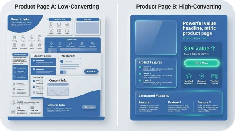
Comparison Table: High-Converting PDP vs Low-Converting PDP
| Criteria | High-Converting PDP | Low-Converting PDP |
|---|---|---|
| Trust Signals | Ratings, guarantees, and shipping confidence within the buy button zone | Trust signals scattered across the page or pushed to the footer |
| Description Depth | Objection-driven, specific, addresses top 3 customer worries above the fold | Generic benefit language that could apply to any product in the category |
| UX Structure | Progressive disclosure — essential info visible, reference info in expandable drawers | Flat layout, everything dumped in sequence, overwhelming on mobile |
| Social Proof Usage | Contextual — reviews surfaced at the moment of relevant doubt | Reviews widget at the bottom of the page, rarely seen, never integrated |
Final Takeaway: Your PDP Is Your Salesperson
Think about what your best human salesperson does when a customer has a question. They don’t say “the information is on the shelf behind you.” They answer it, right there, in the moment. They build confidence. They remove hesitation. They justify the price without being asked.
Your product page has to do all of that — without you in the room.
If your PDP isn’t answering objections, it’s losing sales. If it’s not building trust near the buy decision, it’s losing sales. If it’s not teaching the customer something they didn’t know before they landed, it’s losing sales.
None of this requires a full redesign. Most of it requires better copy, smarter structure, and a willingness to treat your product page like the revenue engine it actually is — not a design brief.
Fix the mistakes above, in order of impact. Start with trust near the buy button. Then objection-driven descriptions. Then the invisible authority layer. Build from there.
The brands that get this right don’t just convert better. They return less, retain more, and compound their CAC efficiency over time. That’s the actual prize.
FAQ
What is the most important element of an ecommerce product page for conversions in 2026?
The buy button zone — the area immediately surrounding your Add to Cart or Buy Now button — is the highest-leverage area on any product page. Trust signals, shipping confidence, ratings, and guarantee statements placed here have a direct and measurable impact on conversion rates. Most brands under-invest in this zone while over-investing in hero imagery.
How long should a D2C product page description be?
There’s no fixed length — but the first 60–120 words must do the heaviest lifting. Lead with objection-driven copy that addresses your customer’s top 3 concerns before they ask. Longer technical content belongs in expandable sections lower on the page. The question isn’t how long your description is. It’s whether it answers the objections that are killing the sale.
Why are product returns increasing for ecommerce brands, and how does the product page affect this?
Research consistently shows that a significant majority of product returns in ecommerce are driven by unmet expectations — the customer received something different from what they understood when they bought it. Vague descriptions, misleading images, missing size or specification information, and unclear use-case guidance all contribute to this. Fixing your product page content reduces returns alongside improving conversions — both drive margin.
What is “invisible authority” in product page UX?
Invisible authority refers to credibility-building UX elements that operate without taking up visible page real estate — tooltips, hover states, expandable “learn more” drawers, and structured FAQ sections that surface detailed information on demand. These elements signal expertise and depth without cluttering the visual design, and they’re increasingly important as AI shopping agents in 2026 start parsing product page content to answer buyer queries on behalf of users.
If your product page is getting traffic but not conversions, the breakdown is usually in how trust and information are structured. At Izwiq Digital, we help D2C brands build product pages that convert — without expensive redesigns.
About the Author
Muhammed W is a content strategist at Izwiq Digital, working directly with small business, D2C and e-commerce brands on SEO content, social media systems, and conversion-focused design.
The insights shared here are based on hands-on client work across health, beauty, SaaS, and B2B — focused on improving engagement, trust, and conversion metrics. Learn more about our services