Ecommerce Product Page Mistakes That Are Costing You 30% of Sales
You’re investing thousands in paid ads. Your traffic numbers look solid. But when you check your conversion rate, something doesn’t add up. The reality? Most ecommerce brands are bleeding revenue not because of their marketing strategy, but because of ecommerce product page mistakes that quietly kill conversions before customers ever reach checkout.
If you’re a founder, CEO, or marketing leader running a lean team, this hits especially hard. Every lost conversion means wasted ad spend and missed growth opportunities. The good news? Fixing these mistakes doesn’t require expensive tools or a complete site overhaul—just strategic changes that address the core issues driving customers away.
Why Most Ecommerce Product Pages Fail to Convert
Traffic isn’t the problem — conversion trust is
Here’s what happens in most D2C businesses: You scale your ad budget, traffic increases, but sales plateau. The instinct is to blame the ads, the targeting, or the price point. But the real culprit is often your product page itself. When visitors land on a page that doesn’t immediately answer their core question—”Why should I buy this?”—they leave. It’s that simple.
The ecommerce conversion rate for most brands hovers between 1-3%. That means for every 100 visitors, 97-99 people leave without buying. Small improvements to your product page can dramatically shift these numbers.
Why founders misdiagnose product page issues
Most founders know their products inside and out. This creates a blind spot: you assume visitors share your knowledge and enthusiasm. You write copy focused on features, specs, and technical details—completely missing what actually drives purchase decisions. Customers don’t buy features; they buy solutions to problems and outcomes they desire.
The Costliest Ecommerce Product Page Mistake (And Why It Hurts Sales)
Focusing on features instead of buyer intent
This is the mistake costing you 30% of sales: prioritizing what your product does over what it accomplishes for the customer. When someone lands on your product page, they’re in problem-solving mode. They need to know within 3-5 seconds whether your product solves their specific pain point.
Consider these two headline approaches:
- Feature-focused: “Premium stainless steel water bottle with double-wall vacuum insulation”
- Benefit-focused: “Keep your drinks ice-cold for 24 hours—even on the hottest days”
The second connects immediately with buyer intent. It speaks to the outcome, not the mechanism. This single shift in messaging can transform your add-to-cart rate.
How unclear value creates hesitation and drop-offs
When your value proposition isn’t crystal clear above the fold, you create cognitive friction. Visitors have to work to understand why they should care. In ecommerce, confusion always leads to abandonment. If someone has to scroll, squint, or guess at your core benefit, they’ll hit the back button instead.
How Product Page Mistake Impacts Your Funnel
Effect on add-to-cart rate
Your add-to-cart rate is the first domino. When product pages fail to communicate value clearly, this metric tanks. Industry benchmarks suggest add-to-cart rates should be between 8-12% for healthy ecommerce businesses. If you’re below 6%, your product page messaging is likely the culprit—not your product quality or pricing.
Impact on paid ads and ROAS
Here’s where ecommerce product page mistakes become expensive. You’re paying $50, $100, or more for each click from Facebook or Google Ads. If your product page converts at 1% instead of 3%, you’re effectively tripling your customer acquisition cost. Poor product pages don’t just lose sales—they make your entire marketing budget less efficient.

Long-term brand trust damage
Beyond immediate conversions, confusing product pages erode trust. When visitors can’t quickly understand what you offer or why it matters, they question your professionalism. They’re less likely to return, recommend you, or explore other products. You’re not just losing one sale—you’re losing lifetime customer value.
Signs Your Product Page Is Losing You Sales
High traffic, low conversion rate
If you’re getting thousands of visitors but conversions remain flat, your traffic source isn’t the issue—your product page is. Check Google Analytics: Are people landing on product pages but bouncing within 15-30 seconds? That’s a red flag that your page isn’t communicating value fast enough.
Short session duration on product pages
Average session duration tells a story. If visitors spend less than 45 seconds on your product pages, they’re not engaging with your content. Either they found what they needed immediately (rare), or more likely, they didn’t find what they were looking for and left.
Frequent pre-purchase questions from customers
Are you constantly answering the same questions via email or chat? Questions like “How does this work?” or “What makes this different?” mean your product page isn’t doing its job. Every question represents dozens of silent visitors who left without asking.
How High-Converting Ecommerce Product Pages Are Structured
Above-the-fold clarity (headline + benefit)
The top portion of your product page—what visitors see before scrolling—must accomplish three things:
- Headline that states the core benefit (not just the product name)
- Supporting subheadline that addresses the main pain point
- High-quality hero image showing the product in use, not just on white background
This is where product page optimization starts. Get this section right, and everything else becomes easier.
Social proof placement that reduces anxiety
Position customer reviews, ratings, and testimonials strategically:
- Star rating near the product name
- Featured testimonial highlighting the main benefit
- Trust badges (free shipping, money-back guarantee) near the CTA button
Social proof combats purchase anxiety. When someone is hesitating, seeing that 500+ people bought and loved your product pushes them over the edge.
Visual hierarchy and scannability
Most visitors don’t read—they scan. Use:
- Bold text for key benefits
- Bullet points instead of paragraphs
- Icons to break up text sections
- White space to reduce cognitive load
Make it effortless for someone to understand your value in 10 seconds of scanning.
Quick Fix Checklist to Eliminate This Product Page Mistake
Messaging fixes you can apply today
These ecommerce product page conversion tips require no design work—just copy changes:
- Rewrite your headline to lead with the primary benefit, not the product name
- Replace feature bullets with “what this means for you” statements
- Add urgency or scarcity where authentic (low stock, limited-time discount)
- Clarify your unique selling proposition in one sentence
Design and layout improvements
- Move your CTA button higher—ideally within the first screen view
- Increase button contrast (make it impossible to miss)
- Add lifestyle images showing the product solving the problem
- Reduce text blocks to 2-3 sentences maximum
Trust and credibility elements to add
- Display security badges near checkout
- Highlight your return policy prominently
- Show real customer photos (user-generated content)
- Include guarantees or warranties above the fold
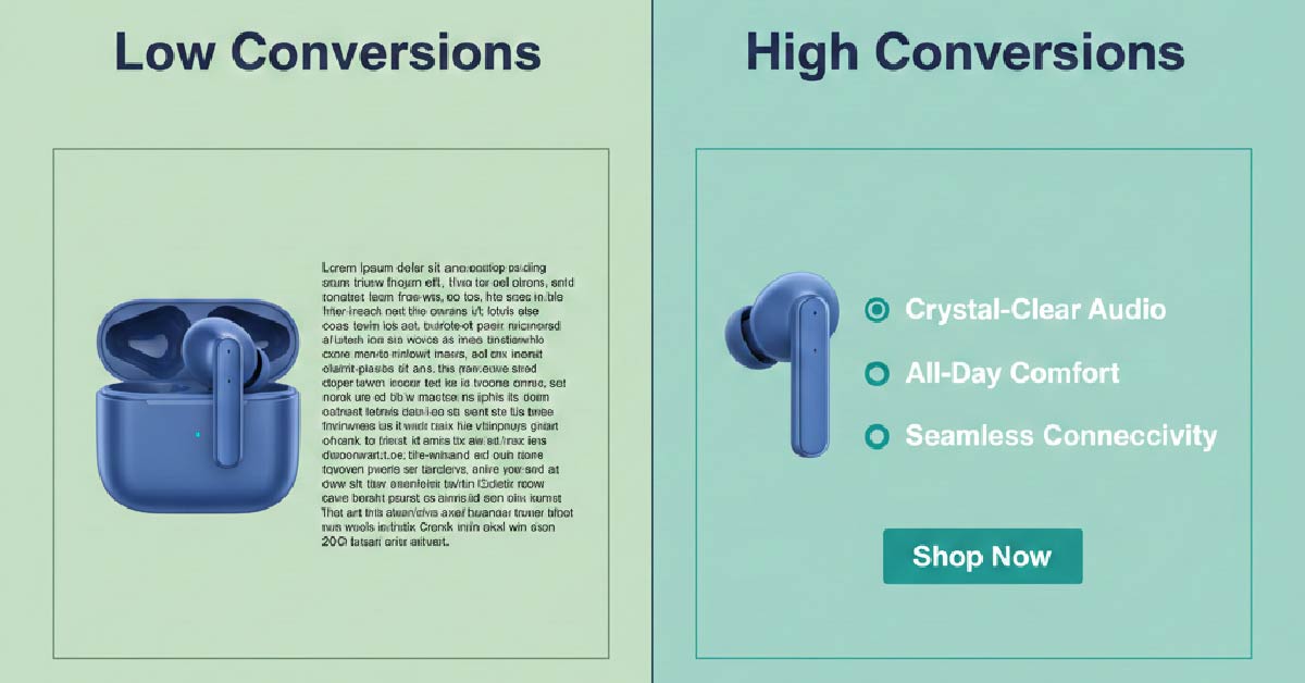
Low-Converting vs High-Converting Product Pages Comparison
| Element | Low-Converting Pages | High-Converting Pages |
|---|---|---|
| Messaging | Feature-focused, technical jargon | Benefit-driven, customer outcomes |
| Visual Hierarchy | Dense paragraphs, no structure | Scannable bullets, bold highlights |
| Trust Elements | Hidden or missing | Prominently displayed near CTA |
| CTA Clarity | Generic “Buy Now” buried low | Action-oriented, above the fold |
| Conversion Outcome | 1-2% conversion rate | 4-6% conversion rate |
Final Takeaway for Founders and Marketing Teams
Why fixing product pages beats increasing ad spend
Most ecommerce brands default to spending more on ads when sales slow down. But if your product pages are broken, you’re just throwing money at a leaky bucket. A 1% improvement in conversion rate has the same impact as a 25% increase in traffic—except it costs nothing.
By addressing ecommerce product page mistakes, you improve every marketing channel simultaneously. Whether traffic comes from Google, Facebook, email, or organic search, everyone lands on the same optimized product page. It’s a multiplier effect.
When to optimize in-house vs. outsource
If your team is under 10 people, you likely don’t have a dedicated conversion rate optimization specialist. That’s okay. Start with the messaging fixes listed above—these require minimal resources. Test different headlines and benefit statements. Track your add-to-cart rate weekly.
If you’re doing over $100K/month in revenue and conversions are still stagnant after initial fixes, consider bringing in outside expertise. A specialist can conduct heat mapping analysis, user testing, and A/B testing at scale. But nail the fundamentals first.
Ready to Stop Losing Sales to Preventable Mistakes?
As a founder or marketing leader, you already have enough on your plate. But here’s the truth: small changes to your product pages can unlock 30% more revenue without spending another dollar on ads.
Start by auditing your top three product pages this week. Ask yourself: Does my headline communicate a clear benefit within 3 seconds? Is my value proposition obvious? Are trust signals visible above the fold?
Fix these core ecommerce product page mistakes, measure the impact on your conversion rate, and watch your ROAS improve across every channel. Your product is great—make sure your pages communicate that clearly.
Your customers are ready to buy. Give them a product page that makes saying “yes” effortless.
Written by Muhammed
Muhammed is a graphic designer and virtual support professional with hands-on experience helping small businesses grow through smart marketing and design. He shares practical strategies that save time, build trust, and See how he helps entrepreneurs succeed without overwhelm.