Add to Cart Optimization: 7 Elements That Make Shoppers Buy Instantly
You’re driving traffic. Your ads are converting. Visitors are landing on your product pages—but they’re not clicking “Add to Cart.” Sound familiar? Most D2C brands obsess over getting people to the page, but the real revenue leak happens in those critical seconds before the cart click. Add to cart optimization isn’t about redesigning your entire site—it’s about fine-tuning the exact elements that turn browsers into buyers. If you’re a founder, marketing manager, or e-commerce lead running a lean team, this guide will show you the 7 proven product page elements that directly impact conversion, without the guesswork or endless A/B testing.
Why “Add to Cart” Is the Most Important Click on Your Store
Traffic doesn’t equal intent
Getting visitors to your store is one thing. Getting them to commit is another. You can have thousands of sessions, but if your add to cart rate is below 5%, you’re not converting intent into action. The gap between “interested” and “buying” is where most D2C brands lose money—and it’s fixable.
Micro-decisions that happen before the click
Before a shopper hits that button, their brain is processing dozens of micro-signals: Is this worth it? Can I trust this brand? What if it doesn’t fit? Will shipping take forever? Your product page needs to answer these questions before they’re even asked. That’s what add to cart optimization is really about—preemptively removing friction, building confidence, and making the “yes” feel inevitable.
Element #1 — A Clear, Outcome-Driven Product Value Proposition
Why features don’t trigger action
“Made from premium organic cotton.” “Lightweight and durable.” These are features—and features don’t sell. Shoppers don’t buy products; they buy outcomes. If your value proposition leads with specs instead of solving a problem, you’re making them work too hard to understand why they should care.
How to write a 5-second value statement
Your value prop should pass the 5-second test: a first-time visitor should instantly understand what your product does for them. Instead of “eco-friendly water bottle,” try “Stay hydrated all day without refills—keeps drinks cold for 24 hours.” The difference? One describes the thing; the other describes the benefit.
Quick formula:
- What it does for the customer (outcome)
- Who it’s for (specificity)
- Why it’s better (differentiation)
Element #2 — Price Anchoring That Makes the Cost Feel Justified
Showing value before showing price
If price is the first thing shoppers see, it’s the first thing they’ll use to judge your product—before understanding its value. Strategic product page optimization means framing cost after context. Show the benefit, the quality, the transformation—then reveal the price as the natural next step.
Bundles, comparisons, and “per-use” framing
Price anchoring works because it gives shoppers a mental reference point. Here’s how to use it:
- Bundles: “Buy 3, save 20%” makes the single unit feel less appealing
- Comparisons: Show the “typical retail price” crossed out
- Per-use framing: “$60 for 60 servings = $1 per day” feels cheaper than “$60”
When done right, price becomes an advantage—not an objection.

Element #4 — Frictionless CTA Design & Placement
Button copy that converts (beyond “Add to Cart”)
“Add to Cart” is functional but not persuasive. Add to cart button optimization starts with copy that reinforces action and reduces hesitation. Try variations like:
- “Get Yours Now” (urgency + ownership)
- “Start Your Order” (low commitment)
- “Add to Bag” (softer, fashion-forward)
- “Try Risk-Free” (removes fear)
The best CTA copy mirrors your brand voice while nudging action.
Color, contrast, and spacing mistakes to avoid
Your CTA button should be the most visually dominant element on the page. Common mistakes:
- Button blends into the background (low contrast)
- Too small or too close to other elements (visual clutter)
- Placed below the fold on mobile (out of sight = out of mind)
Rule of thumb: If your CTA doesn’t immediately catch the eye, it’s not working.
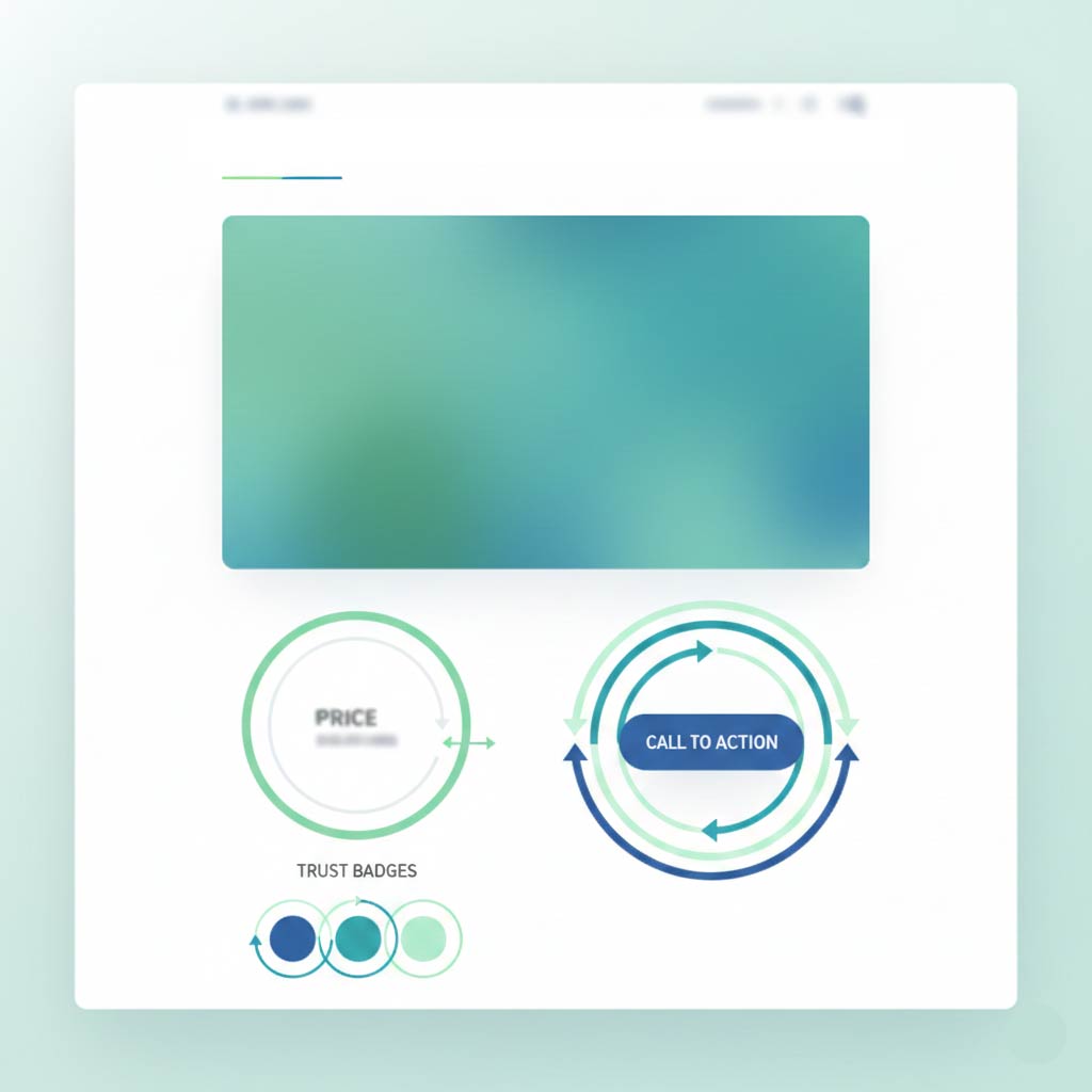
Element #3 — Trust Signals Placed Above the Fold
Reviews vs credibility badges vs social proof
First-time buyers don’t trust you—yet. Trust signals close that gap fast. But not all signals are created equal:
- Reviews (★★★★★): Most powerful for repeat categories (skincare, supplements)
- Credibility badges: Work for regulated industries (certifications, “As Seen In”)
- Social proof: Best for trending products (“12,000+ sold this month”)
Place at least two trust signals above the fold—ideally near the value prop and CTA.
What first-time buyers look for subconsciously
New customers scan for safety cues before they even realize it. They want to know:
- Other people bought this (reviews, ratings)
- The brand is legitimate (media mentions, certifications)
- There’s a safety net (guarantees, return policies)
If these aren’t immediately visible, doubt creeps in—and the cart stays empty.
Element #5 — Product Images That Reduce Buyer Anxiety
Contextual vs studio images
Studio shots are clean, but they don’t answer the shopper’s real question: “What will this look like in my life?” Contextual images—showing your product in use, in real settings, on real people—do.
Best practice: Lead with a high-quality hero image, then follow with lifestyle shots that show scale, texture, and real-world application.
Visual proof over visual beauty
Pretty photos don’t convert if they don’t inform. Shoppers need to see:
- Size and scale (product next to familiar objects)
- Texture and detail (zoom capability)
- Color accuracy (multiple angles)
Think of images as visual objection handlers. Every photo should answer a question or eliminate a doubt.
Element #6 — Objection Handling Before the Buyer Thinks
Shipping, returns, guarantees
Hesitation kills conversions. The fastest way to increase add to cart rate is to proactively address the top objections:
- Shipping: “Free shipping over $50” or “Ships same day if ordered by 3pm”
- Returns: “Free 30-day returns, no questions asked”
- Guarantees: “Love it or your money back”
Place these directly on the product page—not buried in the footer.
FAQ placement that prevents hesitation
An FAQ section on the product page isn’t optional—it’s conversion insurance. Answer the questions shoppers actually have:
- How does it fit/work?
- How long does shipping take?
- What if I don’t like it?
Keep it short, scannable, and immediately visible. If someone has to search for answers, they’ll search somewhere else.
Element #7 — Mobile-First Buying Experience
Thumb zones and scroll behavior
Over 70% of e-commerce traffic is mobile—but most product pages are still designed desktop-first. On mobile, shoppers use their thumbs to navigate, and the bottom third of the screen is the easiest to reach. Your CTA should be fixed or easily accessible without excessive scrolling.
Why mobile ATC rates fail for most D2C brands
Mobile conversions lag because brands make these mistakes:
- CTA button too small to tap accurately
- Forms or size selectors require excessive zooming
- Images load slowly or don’t display properly
- Too much text before the buy button
Fix: Test your entire product page on mobile first, then adapt for desktop—not the other way around.
How to Audit Your Product Page in 15 Minutes
A simple add to cart optimization checklist
You don’t need an expensive agency to increase add to cart rate on product pages. Use this checklist:
- Value prop: Does it explain the outcome in 5 seconds?
- Price anchoring: Is value shown before price?
- Trust signals: Are there at least 2 above the fold?
- CTA design: Is it visually dominant and action-driven?
- Images: Do they reduce anxiety and show context?
- Objections: Are shipping, returns, and guarantees visible?
- Mobile: Is the page thumb-friendly and fast?

What to fix first for fastest ROI
If you’re short on time or resources, prioritize these high-impact fixes:
- CTA button (easiest, fastest win)
- Trust signals above the fold (builds confidence immediately)
- Mobile experience (where most of your traffic lives)
Even small improvements to these three can lift conversions by 10–20% in the first week.
Conclusion & Call to Action
Add to cart optimization isn’t about chasing trends or overhauling your site overnight. It’s about understanding the psychology of the buying moment and removing the invisible friction that keeps shoppers from clicking. Whether you’re a founder wearing too many hats or a marketing manager juggling priorities, these 7 elements give you a clear, actionable path to higher conversions—without the complexity.
Start with one element. Audit it. Fix it. Test it. Then move to the next. The brands that win aren’t the ones with perfect product pages—they’re the ones that iterate faster than their competitors.
Ready to turn more browsers into buyers? Take 15 minutes today to run through the checklist. Your cart (and your revenue) will thank you.
Written by Muhammed
Muhammed is a graphic designer and virtual support professional with hands-on experience helping small businesses grow through smart marketing and design. He shares practical strategies that save time, build trust, and See how he helps entrepreneurs succeed without overwhelm.